Unlike The Upshot’s 2016 school data story, hailed by academics and readers alike, a recent education piece raised several concerns.
By Alexander Russo
A couple of weeks ago on a late-March Friday, the New York Times’ data-focused Upshot section put out a school-related story about how much it costs to buy into different suburbs near New York and other big cities, how much time it takes to commute to work, and how well the schools perform in terms of test scores.
By and large, the story, titled “Good Schools, Affordable Homes” got a lot of positive attention.
Interactive data visualizations like these are an increasingly popular approach to journalistic storytelling. The Upshot, along with FiveThirtyEight, is considered to be among the leaders in producing them. Who doesn’t like an interactive scatter plot (or, even better, an animated GIF) that helps describe an important issue?
AFT president Randi Weingarten was among many who shared and praised the story, tweeting “This is a cool project—NYT looks at schools, housing prices and commutes in big markets.” A 2016 school data piece about student achievement and socioeconomic status in the Upshot was enormously popular and highly regarded.
This time, however, the Times’ design and the use of data also generated a strong surge of disagreement, including objections from the researchers who generated the underlying data, other educators, and data visualization experts who thought the presentation could have been made much clearer and more accurate.
Stanford’s Sean Reardon, whose research was used as the basis for the piece, said the journalists who produced the piece made “a common, but significant, error” in how they presented student test averages. Holy Cross education professor Jack Schneider called the Times piece “toxic” in its use of test score data and form of presentation. Northeastern University visualization expert Dietmar Offenhuber described the Times’ presentation as “puzzling.”
In all, the response to the Times story illustrates the ongoing struggle for reporters when it comes to test score data, the pros and cons of data visualization as a way for journalists to engage readers, and the challenges of meeting the needs of academics, editors, and readers at the same time.
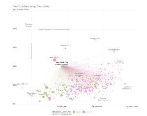
Image of controversial New York Times story about test scores, property values, and commute times.
The initial complaints focused on the graphics’ usefulness.
The bottom right quadrant of the New York City graphic shows many communities where schools are higher-scoring and buying in is cheaper on average than in the city, though the abundance of pink dots show that most involve a commute of more than 30 minutes. (Other cities show somewhat different patterns.)
Harvard’s Joshua Benton, a former education reporter now at the Nieman Lab, wanted the data visualization to allow users to compare multiple districts rather than just look at them one at a time.
“I love these occasional NYT Upshot school interactives, but man I wish they had a list interface for the data,” Benton tweeted. “They’re great for displaying the broader phenomena, but terrible for ‘let me find the 8 districts I might think about moving to.’ ”
Then bigger concerns started getting aired, including a comment from one of the researchers whose work was used in creating the NYT story.
“The article repeatedly conflates test scores with ‘school quality,’” Reardon wrote. “To attribute test scores solely to ‘school quality’ ignores the powerful role that family background plays in shaping opportunity.”
In the Times story, districts with higher test scores were described as being better. But as Reardon and others pointed out, those scores could be as much a function of higher home prices and family incomes than better teaching and learning.
“In our view, average test scores are more appropriately thought of as measures of opportunity – they reflect the sum total of educational opportunities that children have had,” wrote Reardon in a follow-up email.
Then another researcher, Andrew Ho of Harvard University, whose work also was used as part of the story, weighed in as part of an article at The 74, an education news site. The Times story was “written from a very naive … perspective of what school quality is,” Ho told The 74.
[The 74 is funded in part by the Gates Foundation, which also helps fund The Grade.]
Presented in a simplistic, comparative way, says Schneider, test score data like these are too often consumed without skepticism by readers. “You’re not alerting them to the ways that this information is limited,” he said.
“One of the basic things you always have to do when writing about education results is to account for differences in the populations,” said Fredrik deBoer, Academic Assessment Manager Brooklyn College, in a phone interview. “But there was no attempt by The Upshot at all.”
By contrast, the 2016 story – also based on Reardon’s data – was careful to note the influence of family income on school test scores and to compare students based on economic standing.
Pointy-headed academics weren’t the only ones to cry foul over the Times story.
Over at the Education Navigator blog, Timothy Daley pointed out that the scores the Times used were averages across entire districts, not broken out by race, gender, or socioeconomic status:
“Just because the typical student in a school is two grades ahead of schedule doesn’t mean that if you move your child to that school, he will immediately zoom ahead, too.”
In addition, some high-scoring districts have large gaps between how different students achieve, according to race, family income, home language, and other demographics.
Data visualization experts made a variety of suggestions to make the Times chart more easily comprehensible to the reader and also a more accurate reflection of the underlying data.
Northeastern’s Offenhuber noted that it’s not immediately apparent what “grades ahead” means. He suggested a sentence or two using one data point as a point of explanation in the form of an annotation.
To make the chart more immediately graspable to the reader, the University of Miami’s Alberto Cairo would have helped orient the reader with additional arrows, text, and lines indicating “better” and “worse” schools, “cheaper” and “more expensive” housing.
Both Cairo and Offenhuber questioned the many thin lines drawn between the city and the outlying areas, which imply that parents are all commuting into the city for work. Cairo recommended removing the lines entirely.
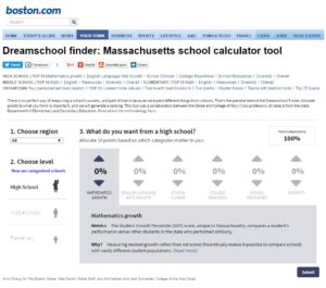
Boston Globe Dream School finder from 2013.
The Times piece raises several important issues:
First and foremost, it highlights journalists’ ongoing struggle to handle complex information responsibly, and specifically to understand what test scores mean and what they don’t. This is especially an issue when the journalists are less familiar with education issues. The piece was produced by tech writer Conor Dougherty rather than one of the Times’ education reporters.
Second, the Times story and the response reminds us that the accountability and responsiveness that journalists ask of public officials is not something that they’re always equally willing to give to readers and sources – especially when the issue is a matter of interpretation than factual accuracy. Neither Dougherty, Upshot editor Amanda Cox, nor anyone else involved in production of the latest example, have been available to answer questions about the piece.
The story also illustrates the power and the perils of interactive graphics, which are being used increasingly at outlets like the Times. As Offenhuber put it, data journalists “don’t always play it safe” when presenting complex dynamics.
Finally, the story also may highlight the gap between how differently journalists, readers, and educators view stories about schools and the education debate.
Generally speaking, academics and education wonks want complete and accurate information in all of its complexity. To them, the Times story seems sloppy and misleading. Journalists generally want to tell a clear, compelling story without getting into so many details that they bog down or obscure the story. Readers – parents, community leaders and elected officials – can sometimes get left out.
It’s likely that the Times journalists weren’t actually meaning to provide a policy-oriented story or even a serious tool for helping families decide where to locate. Instead, the piece may simply have been intended to illustrate the existence of variations among suburban school systems that might otherwise appear to be homogeneous. And it does point out, usefully, that not all higher-scoring schools are in expensive areas.
In that case, including measures of progress or other indicators that would have given nuance to the piece aren’t necessary, since the intention isn’t to be definitive or prescriptive – and parents might not be particularly interested in high-growth districts with low scores, anyway.
Despite his unhappiness with how school quality was defined in the piece, Stanford’s Reardon acknowledged that among parents and policy makers, raw test scores have often been used to label schools good or bad.
“I wouldn’t single out the Times story, or even the media in general, on this,” he wrote. “While researchers are often frustrated when journalists equate test scores with school quality, journalists are not alone in this – parents and state and federal policies often — mistakenly — consider test scores as measures of school quality.”
Still, it is possible for journalists to address a broader set of needs, according to Schneider. The Dream School Finder he helped the Boston Globe develop in 2013 includes school climate and resource data, measures school scores based on growth, and even allows parents to emphasize different attributes that they feel are most important.
Related posts:
Possibilities & Perils Of “Digital Storytelling”
NYT Schools Interactive Still On “Most-Emailed” List Months Later
Steal This School Segregation Story [Visualization]!
ABOUT THE AUTHOR

Alexander Russo
Alexander Russo is founder and editor of The Grade, an award-winning effort to help improve media coverage of education issues. He’s also a Spencer Education Journalism Fellowship winner and a book author. You can reach him at @alexanderrusso.
Visit their website at: https://the-grade.org/